Multi level control
The Patient Journey Demonstrator application that I blogged about in an earlier post shows some nice new UI controls. One of the most useful new features is a “Level of Detail” slider. This slider is used in the demonstrator to specify the level of detail of the content in a listbox. Move the slider to the left and only the basic information is shown. Moving the slider to the right and more and more details are revealed. Descriptions are good, images better :-)
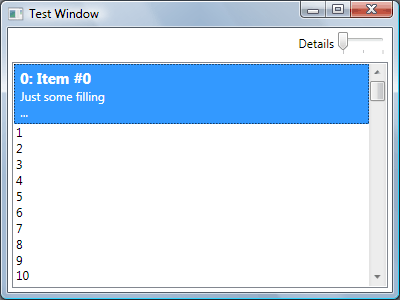
This window demonstrates three levels that can be selected with the slider. In this example three levels are defined and the selected item is always maximized (level 3). I have created a sample program to illustrate its use (download below).
So how does it work?
At first I tried a XAML only solution, but it requires a lot of styles, templates and you have to define them over and over again. Then I thought of a more elegant solution to use a custom control that is located in the DataTemplate. It has a Level property that determines which panel is displayed. Bind the Level property to the slider control and you’re done.
Because this kind of control is often used when making selections, I have added two additional dependency properties that can be used to display the selected item in a special way. Specify a template for the selected item in one of the levels and set the MaxLevel to this template. If you now set the UseMaxLevel property to true, it displays the template in MaxLevel instead of the Level value. An example of this behavior is shown in the sample application.
How do you use it?
Take a look at the sample code and I think it will become clear how to use it. If not, then perform the following.
First you need to define how you can select the level of detail requested. My sample uses a slider, but you can also select it using radio buttons, comboboxes, etc. The most important part is that the result of the selection is an integer value between 0 and 5. Suppose that you also want to use a slider, then add the following code to your XAML file:
<Slider Name="detailSlider" Width="50" Minimum="0" Maximum="4" Value="0"/>
Now you can use the <DetailLevel> element and bind it to the slider control, like this:
<local:DetailLevelWrapper
    Level="{Binding ElementName=detailSlider, Path=Value}">

    <!-- Level 0 -->
    <local:DetailLevelWrapper.Level0Template>
        <ControlTemplate>
            <TextBlock Text="Level 0"/>
        </ControlTemplate>
    </local:DetailLevelWrapper.Level0Template>

    <!-- Level 1 -->
    <local:DetailLevelWrapper.Level1Template>
        <ControlTemplate>
            <TextBlock Text="Level 1"/>
        </ControlTemplate>
    </local:DetailLevelWrapper.Level1Template>

    <!-- Level 2 -->
    <local:DetailLevelWrapper.Level2Template>
        <ControlTemplate>
            <TextBlock Text="Level 2"/>
        </ControlTemplate>
    </local:DetailLevelWrapper.Level2Template>

</local:DetailLevelWrapper>
Make sure you have a reference to the namespace local at the top of your XAML file that points to the proper namespace (and assembly, if you decide to put it into a seperate assembly). The current implementation only supports a maximum of five levels.
If you run your program and move the slider, you will see that the text changes between Level1, Level2 and Level3. Not very exciting, but if you put it inside a DataTemplate and assign it to a listbox, then you can get more exciting results. You don’t need to put the DetailLevelWrapper at the root of your DataTemplate. You can use it as often as you want inside the DataTemplate, so you can share common XAML parts between different levels.
Update (February 2009)
I have updated the control, so it uses a ControlTemplate. This is much more efficient.